top of page

Opposites Attract Promotional Materials
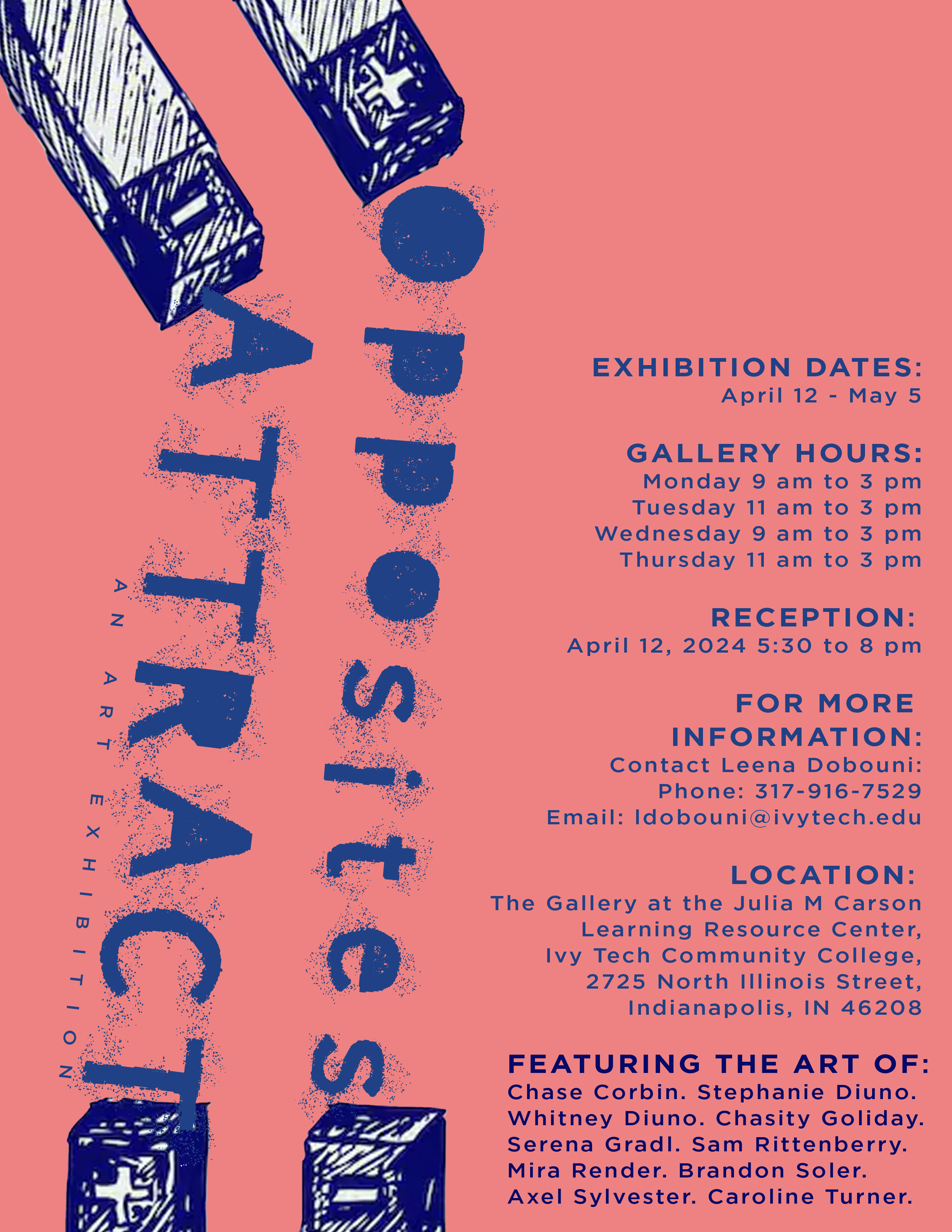
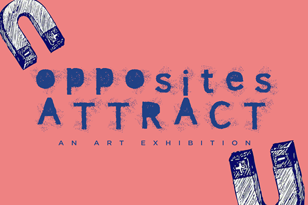
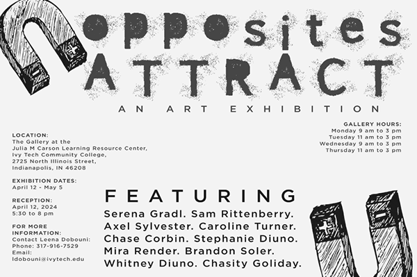
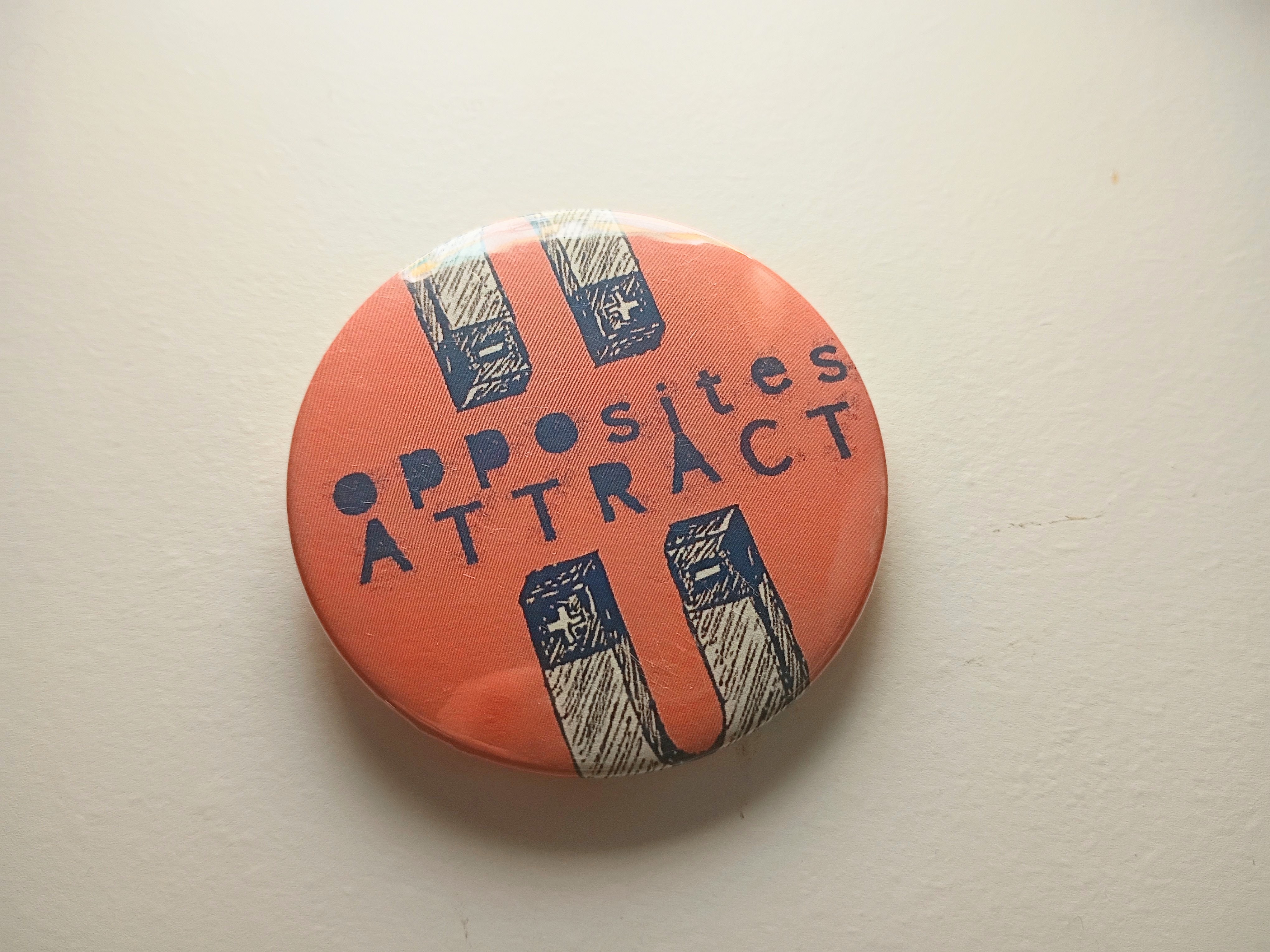
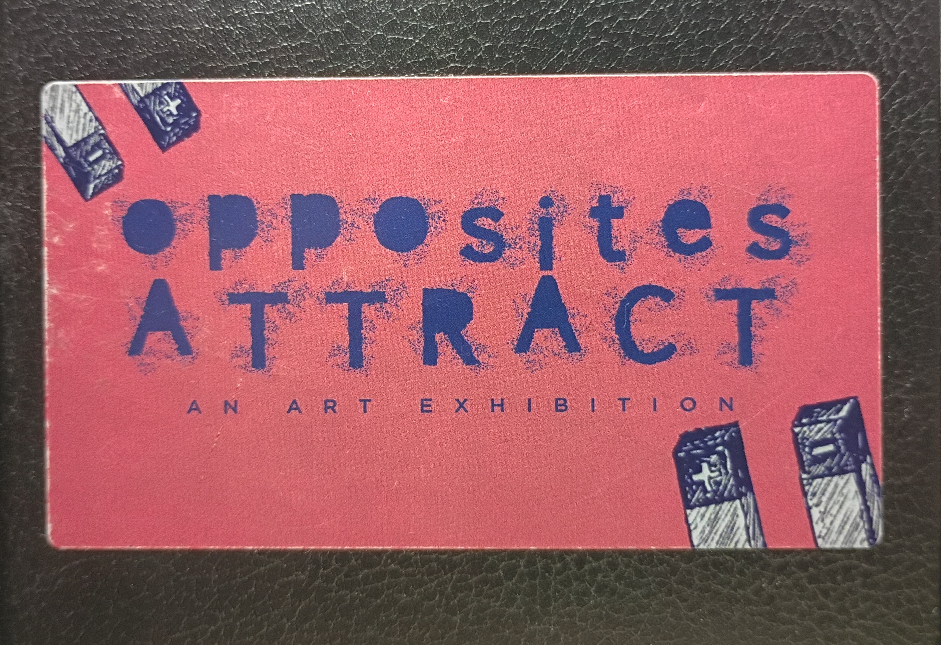
"Opposites Attract" was an art exhibition at Ivy Tech Community College that I had the opportunity of designing promotional postcards, buttons, and stickers for. I was given full creative liberty for this project. The name "Opposites Attract" made me think of magnetic attraction, hence the magnet imagery. I went with an salmon pink and deep blue since these colors are almost "opposite" of one another. I chose for the text to look like magnet dust to really sell the concept of magnetic attraction.
Project type
Branding, Advertising, Graphic Design
Date
2024
Location
Ivy Tech Community College (Indianapolis)

01
Opposites Attract Promotional Materials


bottom of page